Background
SIM 7 was focused on adapting the old, fixed-width site to a new responsive site which would work equally well on all screen sizes. Many mobile or responsive sites simply reduce features and functionality on smaller screens. That was certainly tempting to do for the SIM since we have lists of information with up to 20 columns which clearly cannot fix on a phone-sized screen. The old, non-responsive site would deliver all those columns in minuscule font size requiring you to scroll both directions and zoom in and out. A good responsive site NEVER makes you scroll and zoom. You will rarely (if ever) find an Mobile App that requires scrolling both directions and zooming.
SIM 7.0
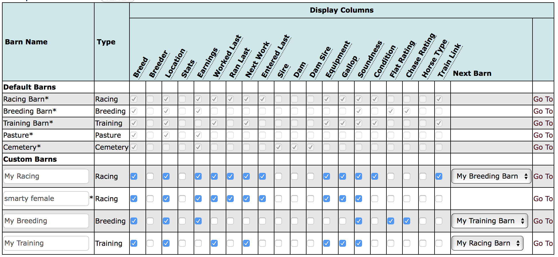
We decided that our SIM 7 responsive design must fulfill all the usual requirements of a responsive site while not loosing ANY functionality and not omitting any data. That posed a real challenge considering our huge tables/lists. But that is what we accomplished. We also improved our lists by adding better paging, the Quick Filter search, and making the sortable columns work correctly for the first time (sorting the entire list rather than just the 500 shown). We did our best to determine which columns were the most important and we gave them priority.
The Problems
The technology that adds all the table functionality (Javascript) runs in your browser and different browsers run at different speeds. The larger the list, the longer it takes to prepare the list. Calculating the column widths and deciding which columns need to be hidden in the reveal-triangle takes time. Some players, particularly using Firefox, noted that the slow speed impacted their enjoyment of the SIM. Also, it seems that every column is important to you - you don't like it when anything is "hidden" in the reveal-triangle.
Now we have a problem. A good responsive design includes all the data and doesn't require horizontal scrolling, but happy SIM players may prefer to scroll if that means they don't have to click the triangle.
New Option
For a limited time, we added a "Choose Horse List Format (beta)" option in the Settings option under the Profile menu. There are two options:
- Responsive Format - Horse Lists will adapt to all screen sizes. It will hide columns that don't fit horizontally and move those columns to the reveal-triangle.
- Scrollable Table - Lists will load faster and display all columns whether or not they fit on the screen. If they don't fit, you will have to scroll to the right to see them.


